CSS Background Patterns: examples
Last updated:Table of Contents
Striped background
Just change the base
background-colorto do it for other colours too
Just use this (all browser variations included) to have stripes based on a single color
body {
    /*base colour*/
    background-color: #FF1975;

    /*these control the width of the stripes*/
    -webkit-background-size: 50px 50px;
    -moz-background-size: 50px 50px;
    background-size: 50px 50px;

    /*these control the inclination*/
    background-image:
      -webkit-gradient(linear, 0 0, 100% 100%,
      color-stop(.25, rgba(255, 255, 255, .2)), color-stop(.25, transparent),
      color-stop(.5, transparent), color-stop(.5, rgba(255, 255, 255, .2)),
      color-stop(.75, rgba(255, 255, 255, .2)), color-stop(.75, transparent),
      to(transparent));
    background-image:
      -webkit-linear-gradient(-45deg, rgba(255, 255, 255, .2) 25%, transparent 25%,
      transparent 50%, rgba(255, 255, 255, .2) 50%, rgba(255, 255, 255, .2) 75%,
      transparent 75%, transparent);
    background-image:
      -moz-linear-gradient(-45deg, rgba(255, 255, 255, .2) 25%, transparent 25%,
      transparent 50%, rgba(255, 255, 255, .2) 50%, rgba(255, 255, 255, .2) 75%,
      transparent 75%, transparent);
    background-image:
      -ms-linear-gradient(-45deg, rgba(255, 255, 255, .2) 25%, transparent 25%,
      transparent 50%, rgba(255, 255, 255, .2) 50%, rgba(255, 255, 255, .2) 75%,
      transparent 75%, transparent);
    background-image:
      -o-linear-gradient(-45deg, rgba(255, 255, 255, .2) 25%, transparent 25%,
      transparent 50%, rgba(255, 255, 255, .2) 50%, rgba(255, 255, 255, .2) 75%,
      transparent 75%, transparent);
    background-image:
      linear-gradient(-45deg, rgba(255, 255, 255, .2) 25%, transparent 25%,
      transparent 50%, rgba(255, 255, 255, .2) 50%, rgba(255, 255, 255, .2) 75%,
      transparent 75%, transparent);
}
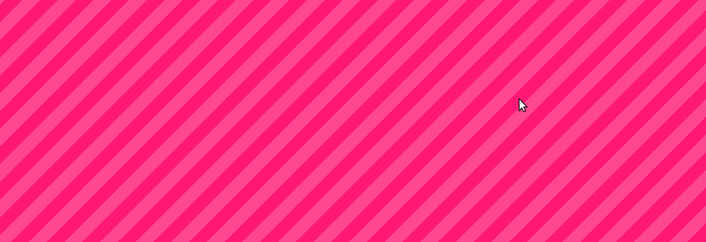 Pink-striped background generated using
 the code above
Just copy paste and try it out.1
Just change the base background-color and you can do some variations like these:


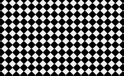
Two color checkers
Example: webkit only
body {
    background-color: none;
    background-image:
      -webkit-linear-gradient(45deg, blue 25%, transparent 25%, transparent 75%, blue 75%, blue),
      -webkit-linear-gradient(-45deg, red 25%, transparent 25%, transparent 75%, red 75%, red);
    background-size:15px 15px;
}
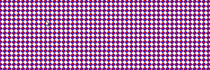 The key word here is superposition.
 If you, take an empty background and
place a 45º blue gradient and
then a -45º red gradient on top of
it, you'll end up with this
1: Each browser requires specific instructions, this is why there are so many lines