Pandas Dataframe: Plot Examples with Matplotlib and Pyplot
Last updated:
- Scatter plot of two columns
- Bar plot of column values
- Line plot, multiple columns
- Save plot to file
- Bar plot with group by
- Stacked bar plot with group by
- Stacked bar plot with group by, normalized to 100%
- Stacked bar plot, two-level group by
- Stacked bar plot with two-level group by, normalized to 100%
All examples can be viewed in this sample Jupyter notebook
You need to have the matplotlib module installed for this!
Versions used: Pandas 1.x, matplotlib 3.0.x
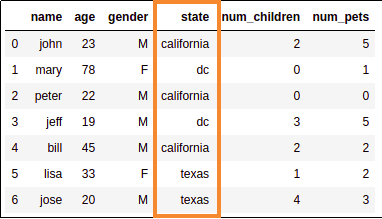
Sample data for examples
import pandas as pd

df = pd.DataFrame({
    'name':['john','mary','peter','jeff','bill','lisa','jose'],
    'age':[23,78,22,19,45,33,20],
    'gender':['M','F','M','M','M','F','M'],
    'state':['california','dc','california','dc','california','texas','texas'],
    'num_children':[2,0,0,3,2,1,4],
    'num_pets':[5,1,0,5,2,2,3]
})
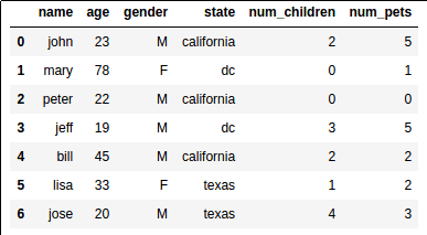 This is what our sample dataset looks like
Pandas has tight integration with matplotlib.
You can plot data directly from your DataFrame using the plot() method:
Scatter plot of two columns
import matplotlib.pyplot as plt
import pandas as pd

# a scatter plot comparing num_children and num_pets
df.plot(kind='scatter',x='num_children',y='num_pets',color='red')
plt.show()
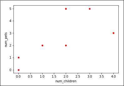 Looks like we have a trend
Bar plot of column values
import matplotlib.pyplot as plt
import pandas as pd

# a simple line plot
df.plot(kind='bar',x='name',y='age')
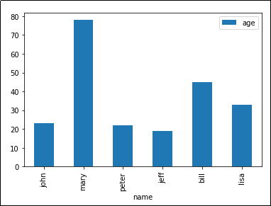 'kind' takes arguments such as 'bar', 'barh' (horizontal bars), etc
Line plot, multiple columns
Just reuse the Axes object.
import matplotlib.pyplot as plt
import pandas as pd

# gca stands for 'get current axis'
ax = plt.gca()

df.plot(kind='line',x='name',y='num_children',ax=ax)
df.plot(kind='line',x='name',y='num_pets', color='red', ax=ax)

plt.show()
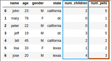 Source dataframe
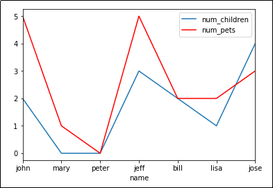
plot() takes an optional argument 'ax' which allows you to reuse an Axis to plot multiple lines
Save plot to file
Instead of calling plt.show(), call plt.savefig('outputfile.png'):
import matplotlib.pyplot as plt
import pandas as pd

df.plot(kind='bar',x='name',y='age')

# the plot gets saved to 'output.png'
plt.savefig('output.png')
Bar plot with group by
import matplotlib.pyplot as plt
import pandas as pd

df.groupby('state')['name'].nunique().plot(kind='bar')
plt.show()
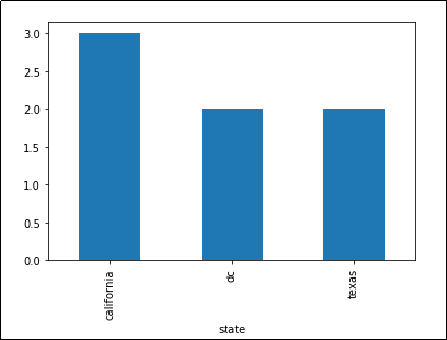 Number of unique names per state
Stacked bar plot with group by
Example: plot count by category as a stacked column:
create a dummy variable and do a two-level group-by based on it:
fix the x axis label and the legend
import matplotlib.pyplot as plt

# create dummy variable them group by that
# set the legend to false because we'll fix it later
df.assign(dummy = 1).groupby(
  ['dummy','state']
).size().to_frame().unstack().plot(kind='bar',stacked=True,legend=False)

plt.title('Number of records by State')

# other it'll show up as 'dummy'
plt.xlabel('state')

# disable ticks in the x axis
plt.xticks([])

# fix the legend
current_handles, _ = plt.gca().get_legend_handles_labels()
reversed_handles = reversed(current_handles)

labels = reversed(df['state'].unique())

plt.legend(reversed_handles,labels,loc='lower right')
plt.show()
 3 rows for California,
 2 for DC and texas
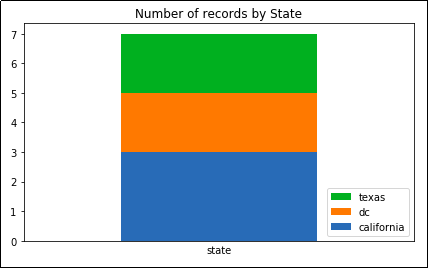 Note how the legend follows the
 same order as the actual column.
This makes your plot easier to read.
Stacked bar plot with group by, normalized to 100%
A plot where the columns sum up to 100%.
Similar to the example above but:
normalize the values by dividing by the total amounts
use percentage tick labels for the y axis
Example: Plot percentage count of records by state
import matplotlib.pyplot as plt
import matplotlib.ticker as mtick

# create dummy variable then group by that
# set the legend to false because we'll fix it later
df.assign(dummy = 1).groupby(
  ['dummy','state']
).size().groupby(level=0).apply(
    lambda x: 100 * x / x.sum()
).to_frame().unstack().plot(kind='bar',stacked=True,legend=False)

# or it'll show up as 'dummy'
plt.xlabel('state')

# disable ticks in the x axis
plt.xticks([])

# fix the legend or it'll include the dummy variable
current_handles, _ = plt.gca().get_legend_handles_labels()
reversed_handles = reversed(current_handles)
correct_labels = reversed(df['state'].unique())

plt.legend(reversed_handles,correct_labels)

plt.gca().yaxis.set_major_formatter(mtick.PercentFormatter())
plt.show()
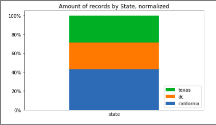 Record count grouped by state only, summing up to 100%
Stacked bar plot, two-level group by
Just do a normal groupby() and call unstack():
import matplotlib.pyplot as plt
import pandas as pd

df.groupby(['state','gender']).size().unstack().plot(kind='bar',stacked=True)
plt.show()
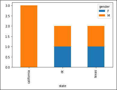 Stacked bar chart showing the number of people
 per state, split into males and females
Another example: count the people by gender, spliting by state:
import matplotlib.pyplot as plt
import pandas as pd

df.groupby(['gender','state']).size().unstack().plot(kind='bar',stacked=True)
plt.show()
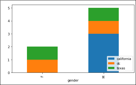 Now grouped by
 'state' and 'gender'
Stacked bar plot with two-level group by, normalized to 100%
Sometimes you are only ever interested in the distributions, not raw amounts:
import matplotlib.ticker as mtick
import matplotlib.pyplot as plt

df.groupby(['gender','state']).size().groupby(level=0).apply(
    lambda x: 100 * x / x.sum()
).unstack().plot(kind='bar',stacked=True)

plt.gca().yaxis.set_major_formatter(mtick.PercentFormatter())
plt.show()
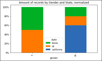 Record count grouped by state and gender, with normalized columns
 so that each sums up to 100%