Matplotlib Errorbar Examples
Last updated:Table of Contents
WIP Alert This is a work in progress. Current information is correct but more content may be added in the future.
All code can be found on this jupyter notebook
Bar plot with error bars
The correct name is standard error because we're calculating the standard deviation of a sample.
Extract the mean and std deviation (as a proxy for error) from the data and use plt.bar() to plot the bars and then plt.vlines() to plot the vertical lines:
import pandas as pd
import numpy as np
import matplotlib.pyplot as plt
df = pd.DataFrame({
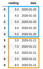
"reading": [5.0, 4.0, 5.0, 4.0, 5.0, 3.0, 7.0, 5.0, 2.0, 8.0],
"date": [
"2020-01-20",
"2020-01-20",
"2020-01-20",
"2020-01-20",
"2020-01-20",
"2020-01-21",
"2020-01-21",
"2020-01-21",
"2020-01-21",
"2020-01-21"
]})
# aggregate data by date
df_grouped = df.groupby('date')['reading'].agg(['mean','std']).reset_index()
xs = range(len(df_grouped['mean'].values))
ys = df_grouped['mean'].values
labels = df_grouped['date'].values
plt.bar(xs, ys)
plt.vlines(xs,
df_grouped['mean'] - df_grouped['std'],
df_grouped['mean'] + df_grouped['std'])
 5 readings for Jan 20, and
 5 readings for Jan 21
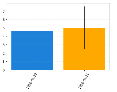 Note that the bat plots indicate similar
 means but the error bars indicate that
the data for Jan 21 is much more spread out.
Line plot with error bars
TODO