Matplotlib Subplots: Best Practices and Examples
Last updated:
Table of Contents
- 2 Plots side-by-side
- 2 Plots on top of the other
- 4 plots in a grid
- Pandas plots
- Set subplot title
- Padding between plots
- Align axes
Using Matplotlib v3 and pandas v1.0. See all code on this jupyter notebook
2 Plots side-by-side
Use fig, axes = plt.subplots(1,2)
import matplotlib.pyplot as plt
import numpy as np

# sample data
x = np.linspace(0.0,100,50)
y = np.random.uniform(low=0,high=10,size=50)

# create figure and axes
fig, (ax1,ax2) = plt.subplots(1,2) # 1 row, 2 columns

# just plot things on each individual axes
ax1.scatter(x,y,c='red',marker='+')
ax2.bar(x,y)
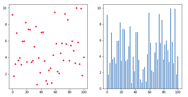 Two subplots side-by-side on the same figure
2 Plots on top of the other
Use fig, axes = plt.subplots(2,1):
import matplotlib.pyplot as plt
import numpy as np

# sample data
x = np.linspace(0.0,100,50)
y = np.random.uniform(low=0,high=10,size=50)

# create figure and axes
fig, (ax1,ax2) = plt.subplots(2,1)

# just plot things on each individual axes
ax1.scatter(x,y,c='red',marker='+')
ax2.bar(x,y)
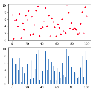 Two plots one on top of the other
4 plots in a grid
Use fig, ((ax1,ax2),(ax3,ax4)) = plt.subplots(2,2):
import matplotlib.pyplot as plt
import numpy as np

# sample data
x = np.linspace(0.0,100,50)
y = np.random.uniform(low=0,high=10,size=50)

# plt.subplots returns an array of arrays. We can
# directly assign those to variables directly
fig, ((ax1,ax2),(ax3,ax4)) = plt.subplots(2,2)

# just plot things on each individual axes
ax1.scatter(x,y,c='red',marker='+')
ax2.bar(x,y)
ax3.scatter(x,y,marker='x')
ax4.barh(x,y)

plt.show()
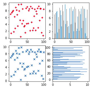 The same set of data points plotted
 in 4 different ways, in 4 different
subplots.
Pandas plots
Call df.plot(...ax=<axis>), plot the chart in one of the suplot axes:
import matplotlib.pyplot as plt
import pandas as pd

# sample data
df = pd.DataFrame({
    'string_col':['foo','bar','baz','quux','bum','bam','blah'],
    'x':[10,20,30,40,20,10,30],
    'y':[1,3,1,1,4,5,8]
})

# plt.subplots returns an array of arrays. We can
# directly assign those to variables directly
fig, ((ax1,ax2),(ax3,ax4)) = plt.subplots(2,2)

# bar plot for column 'x'
df.plot(y='x', kind='bar', ax=ax1)

# horizontal bar plot for column 'y'
df.plot(y='y', kind='bar', ax=ax2)

# both columns in a scatter plot
df.plot('x','y', kind='scatter', ax=ax3)

# to have two lines, plot twice in the same axis
df.plot(y='x', kind='line', ax=ax4)
df.plot(y='y', kind='line', ax=ax4)
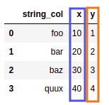 Source dataframe: two numeric columns
 called
x and y
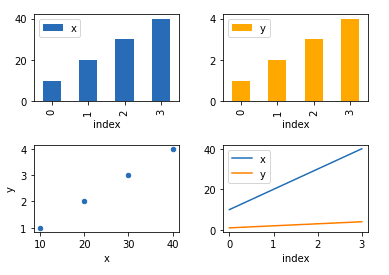 Four separate subplots, in order:
 bar plots for
x and y, scatter plot and two line plots together.
Set subplot title
Call <axis>.set_title(<title-text>) on an individual axis object to set the title for that individual subplot only:
fig, ((ax1,ax2),(ax3,ax4)) = plt.subplots(2,2)

# sample data
x = np.linspace(0.0,100,50)
y = np.random.uniform(low=0,high=10,size=50)

# plot individual subplots
ax1.bar(x,y)
ax2.bar(x,y)
ax3.scatter(x,y)
ax4.plot(x)

ax4.set_title('This is Plot 4',size=14)
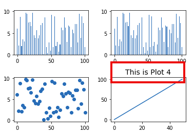 Set title to individual subplot only
Padding between plots
wspacestands for width space,hspacestands for height space
Use plt.subplots_adjust(wspace=<horizontal-padding>, hspace=<vertical-padding>). The default value is 0.2
import numpy as np
import matplotlib.pyplot as plt

# sample data
x = np.linspace(0.0,100,50)
y = np.random.uniform(low=0,high=10,size=50)

# plt.subplots returns an array of arrays. We can
# directly assign those to variables directly
fig, ((ax1,ax2),(ax3,ax4)) = plt.subplots(2,2)

# just plot things on each individual axes
ax1.scatter(x,y,c='red',marker='+')
ax2.bar(x,y)
ax3.scatter(x,y,marker='x')
ax4.barh(x,y)

# here, set the width and the height between the subplots
# the default value is 0.2 for each
plt.subplots_adjust(wspace=0.50, hspace=1.0)
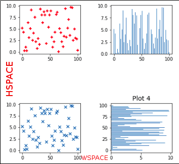 Set
Set wspace to 0.50 and hspace to 1.0 to increase the width and the height, respectively.
Align axes
To make axes for subplots match each other, call <axis>.set_xlim(<start>,<end>) to configure x-axis and <axis>.set_ylim(<start>,<end>) to configure y-axis:
import numpy as np
import matplotlib.pyplot as plt

# plt.subplots returns an array of arrays. We can
# directly assign those to variables directly
fig, ((ax1,ax2)) = plt.subplots(1,2)

# sample data in different magnitudes
x = np.linspace(0.0,100,50)
y1 = np.random.normal(loc=10, scale=2, size=10)
y2 = np.random.normal(loc=20, scale=2, size=10)

# plot in each subplot
ax1.plot(y1)
ax2.plot(y2)

ax1.set_ylim(0,25)
ax2.set_ylim(0,25)
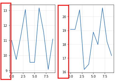 BEFORE: by default, axes get
 defined by the data in the
plot, so each will
be different, making it
hard to read
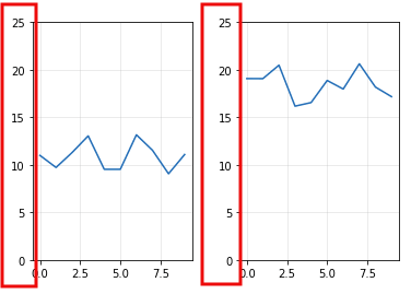 AFTER: make axes in both
 subplots have the same limits
so that they are directly
comparable