Pandas Dataframe examples: Plotting Histograms
Last updated:- Histogram of column values
- Relative histogram (density plot)
- Two plots one the same Axes
- Group large values
All code available on this jupyter notebook
Histogram of column values
You can also use numpy arange to create bins automatically:
np.arange(<start>,<stop>,<step>)
Example: Plot histogram of values in column "age"
import pandas as pd
import matplotlib.pyplot as plt

df = pd.DataFrame({
    'name':['john','mary','peter','jeff','bill','lisa','jose'],
    'age':[23,78,22,19,45,33,20],
    'gender':['M','F','M','M','M','F','M'],
    'state':['california','dc','california','dc','california','texas','texas'],
    'num_children':[2,0,0,3,2,1,4],
    'num_pets':[5,1,0,5,2,2,3]
})

df[['age']].plot(kind='hist',bins=[0,20,40,60,80,100],rwidth=0.8)
plt.show()
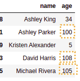
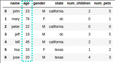 Source dataframe
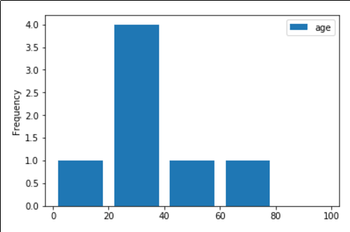 The most common age group is between 20 and 40 years old
Relative histogram (density plot)
In other words, plot the density of the values in a column, regardless of scale.
This is useful to get a relative histogram of values, allowing you to compare distributions of different sizes and scales.
Pass density=True to df.plot(kind='hist'):
import scipy.stats as st
from matplotlib import pyplot as plt

# standard normal distribution
dist_1 = st.norm(loc=0.0,scale=1.0)

df1 = pd.DataFrame({
    'value_1': dist_1.rvs(10000),
})

# 'column' specifies the column
df1.plot(kind='hist', column='value_1', density=True)
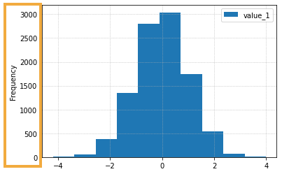 If you don't pass
 density=Truethe y-axis is just the absolute frequency of values
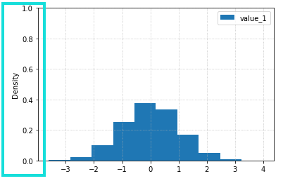 By passing
 density=True the plot is nowa density plot, and the y-axis now represents relative frequency.
Two plots one the same Axes
We frequently want to plot two (or more) distributions together so we can compare them even if the samples have different sizes
Pass the same ax to both and use alpha to make the plots transparent:
import scipy.stats as st
from matplotlib import pyplot as plt

# just two dummy distributions
dist_1 = st.norm(loc=0.0,scale=5.0)
dist_2 = st.norm(loc=5,scale=1.0)

nums_1 = dist_1.rvs(1000)
nums_2 = dist_2.rvs(50000) # note that it's a much larger sample

df1 = pd.DataFrame({'value_1': nums_1})

df2 = pd.DataFrame({'value_2': nums_2})

ax = plt.gca()

# note we're using density=True because the two samples
# have different sizes
df1.plot(kind='hist', ax=ax, density=True, alpha=0.5)
df2.plot(kind='hist', ax=ax, density=True, alpha=0.5)
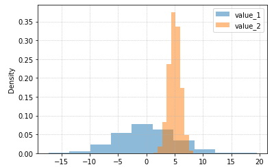 By plotting both distributions on the same plot and
 by setting
alpha you can easily compare both and see where they overlap (around x=5)
Group large values
In other words, truncate large values after a given point into a single bucket, called "+∞":
Example: group values larger than 100 into a separate column:
 sample data used: note that there are rows where
 age is larger than 100!
import pandas as pd
import random
import matplotlib.pyplot as plt
import numpy as np

# install via pip install faker
from faker import Faker
fake = Faker()

df = pd.DataFrame([{
    'name':fake.name(),
    'age': random.randint(1,120), # generate age from 1 to 120
} for i in range(0,100)]) # dataframe should have 100 rows

# define the bins
step_size          = 20
max_tick           = 100
original_bins      = np.arange(0, max_tick+1, step_size)
new_bins           = np.append(original_bins, [max_tick+step_size+1])
max_value          = max(original_bins)

# function to format the label
def format_text(current_value, max_value, label):
    return label if current_value > max_value else current_value

df[['age']].plot(kind='hist', bins=new_bins, rwidth=0.8)

current_ticklabels = plt.gca().get_xticks()

plt.gca().set_xticklabels([format_text(x, max_value, '+∞') for x in current_ticklabels])

plt.show()
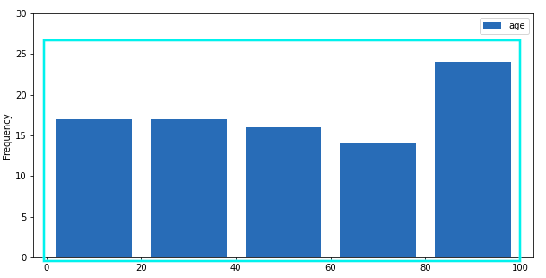 If you naively plot histogram with 0-20 buckets,
 some of the data will be missing!
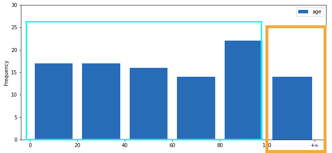 Values larger than 100 grouped into the new bucket