Some Thoughts on and Patterns for Web Forms
Last updated:FORM LABELS
Well I have for some time wondered if we could somehow get rid of labels in forms because they make it a little bit harder to design good looking forms. There is a html attribute called placeholder that helps us accomplish that. Take a look at this labelless form:

It does look clean and simple and I thought it would be all nice and standardized if I took to making all my forms like this but it didn't last very long because in a real-life form you have all sorts of inputs that don't support placeholders, for obvious reasons (there's no space like you have in button, text inputs and text areas), like checkboxes, radioboxes and some non-standard, custom form widgets.
I also think that it might be confusing if you want to support both placeholders and default values which we sometimes need in our forms.
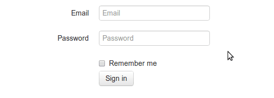
But nobody is saying you can't have labels and placeholders in your form, although I don't really see the benefit of having both:

So my opinion is that it's not possible to completely get rid of labels. At least not right now.
So, if you need labels for some inputs and you want consistency in your forms, the little (not necessarily correct) wannabe designer inside my head tells me I should put labels in all inputs so as not to confuse users.
VALIDATION MESSAGES
Users nowadays expect forms to have some kind of client-side (with AJAX when possible or desired) validation so they can notice right away when they've not provided a needed field or if a username is already taken or the password is not the correct length:

That looks ok but the developer in me (not necessarily correct though) feels that such arbitrary-length validation messages may create all sorts of trouble when we come to code it. It's much easier to code when things are of a expected size, so I guess that using icons with tooltips may be a better alternative:
