Splunk Examples: Timecharts
Last updated:Splunk version used: 8.2.6.
Custom period
To set a custom step size in timecharts, use span=<period> after timechart:
Example: group by 5-minute buckets, count rows
source=logs "some-search-criteria"
| timechart span=5m count
TODO redo using tutorial data, add screenshots
Group by value, count by period
Here you can extract a value using rex first and then apply count by:
Example: Count how many occurrences of each type of purchase by period
source=logs "new-purchase-made"
| rex "purchase-type: (?<type>\w+) "
| timechart count by type
TODO redo using tutorial data, add screenshots
Bars and lines in the same chart
Examples use the tutorial data from Splunk
This is useful if you want to plot something like the amount of requests (as bars) and the average response time (line) on the same chart.
You want to use Chart Overlays for that.
Using the tutorialdata, create a query with a timechart
index="tutorialdata" sourcetype="access_combined_wcookie"
| rex field=_raw "HTTP 1.1\" (?<retcode>[0-9]+) "
| rex field=_raw "(?<time_taken>[0-9]+)$"
| where retcode=200
| timechart count, avg(time_taken) as avg_time_taken span=1h
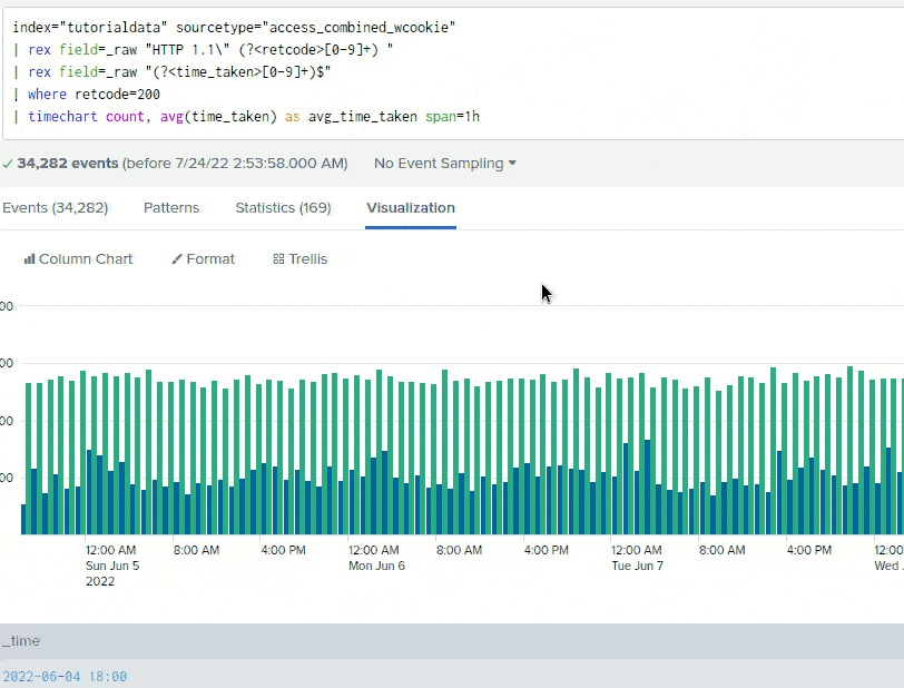
Select Column Chart as the chart type (for the count attribute) and then add the other attribute avg_time_taken as an Overlay:
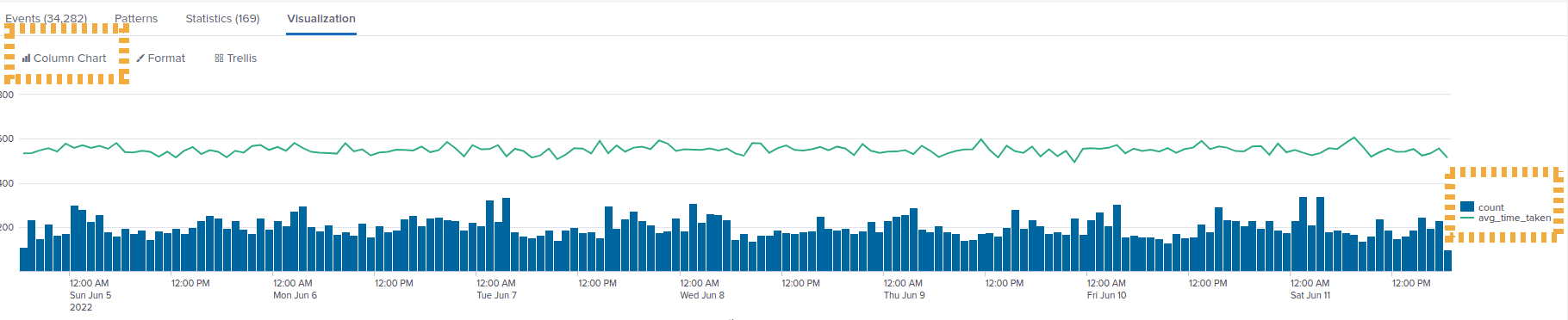 A splunk
 timechart with bars and lines together in the same plot
 Configuring the overlay option on
 Splunk visualization