The Calibration-Accuracy Plot: Introduction and Examples
Last updated:- Calibration vs Accuracy
- The calibration-accuracy plot
- Simplest possible example with default options
- Example: model with good calibration but low accuracy
- Example: a badly calibrated model with high accuracy
- Example: a very badly calibrated model, with low accuracy
View all these examples on this example notebook
Calibration vs Accuracy
For more information on model calibration, see Introduction to AUC and Calibrated Models with Examples using Scikit-Learn
Calibration1 is a term that represents how well your model's scores can be interpreted as probabilities.
For example: in a well-calibrated model, a score of 0.8 for an instance actually means that this instance has 80% of chance of being TRUE.
Training models that output calibrated probabilities is very useful for whoever uses your model's outputs, since they will have a better idea of how likely the events are. This is especially relevant in fields such as:
Likelihood of credit default for a client
Likelihood of fraud in a transaction
| Calibration | Accuracy |
|---|---|
| Measures how well your model's scores can be interpreted as probabilities |
Measures how often your model produces correct answers |
The calibration-accuracy plot
The Python version of the calibration-accuracy plot can be found on library ds-util. You can install it using pip:
pip install dsutil
The calibration-accuracy plot is a way to visualize how well a model's scores correlate with the average accuracy in that confidence region.
In short, it answers the following question: what is the average accuracy for the model at each score bucket?. The closer those values, the better calibrated your model is.
If the line that plots the accuracies is a perfect diagonal, it means your model is perfectly calibrated.
Simplest possible example with default options
You can install the
dsutillibrary viapip install dsutil
import numpy as np
from dsutil.plotting import calibration_accuracy_plot

# binary target variable (0 or 1)
y_true = np.random.choice([0,1.0],500)

y_pred = np.random.normal(size=500)

calibration_accuracy_plot(y_true, y_pred)
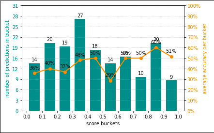 Simplest possible example, using default options. Your
 results may vary because data points have been
randomly generated.
Example: model with good calibration but low accuracy
For more information how to generate dummy data with sklearn, see Scikit-Learn examples: Making Dummy Datasets
import numpy as np
from dsutil.plotting import calibration_accuracy_plot

from sklearn.datasets import make_classification
from sklearn.linear_model import LogisticRegression
from sklearn.model_selection import train_test_split

# generate a dummy dataset
X, y = make_classification(n_samples=2000, n_features=5)

X_train, X_test, y_train, y_test = train_test_split(X, y, test_size=0.33)

# train a simple logistic regression model
clf = LogisticRegression()
clf.fit(X_train,y_train)

y_pred = clf.predict_proba(X_test)[:,1]

calibration_accuracy_plot(y_test, y_pred)
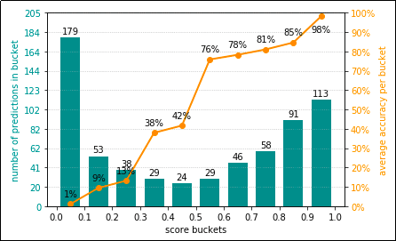 Logistic Regression models are calibrated by default.
 In this case, the model's accuracy isn't very good (see how many
predictions are in the lowest bucket), but you can have a reasonably good
expectation that scores are welll-calibrated.
Example: a badly calibrated model with high accuracy
from dsutil.plotting import calibration_accuracy_plot

from sklearn.datasets import make_classification
from sklearn.svm import SVC
from sklearn.preprocessing import MinMaxScaler
from sklearn.model_selection import train_test_split

X, y = make_classification(n_samples=2000, n_features=5, class_sep=0.01)

X_train, X_test, y_train, y_test = train_test_split(X, y, test_size=0.33)

clf = SVC(kernel='rbf')
clf.fit(X_train,y_train)

y_pred_raw = clf.decision_function(X_test)

# need to normalize the scores because decision_function outputs absolute values
# and reshape so it's a column vector
y_pred = MinMaxScaler().fit_transform(y_pred_raw.reshape(-1,1)).ravel()

calibration_accuracy_plot(y_test, y_pred)
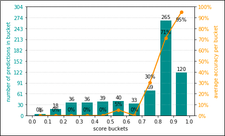 In this case, we have a badly calibrated
 model. This model is almost equally bad if the score
is anywhere from 0.0 - 0.7, so the line indicating the
average accuracy per bucket doesn't look very much like a
diagonal. However, a large percentage of the scores are in the 0.7 - 1.0 range,
so overall the accuracy is not bad at all.
Example: a very badly calibrated model, with low accuracy
from dsutil.plotting import calibration_accuracy_plot

from sklearn.datasets import make_classification
from sklearn.svm import SVC
from sklearn.preprocessing import MinMaxScaler
from sklearn.model_selection import train_test_split

X, y = make_classification(n_samples=2000, n_features=5, class_sep=0.01)

X_train, X_test, y_train, y_test = train_test_split(X, y, test_size=0.33)

clf = SVC(kernel='linear')
clf.fit(X_train,y_train)

y_pred_raw = clf.decision_function(X_test)

# need to normalize the scores because decision_function outputs absolute values
# and reshape so it's a column vector
y_pred = MinMaxScaler().fit_transform(y_pred_raw.reshape(-1,1)).ravel()

calibration_accuracy_plot(y_test, y_pred)
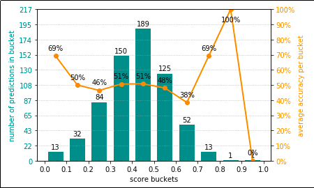 In this case, a badly calibrated model (the
 orange line is nowhere near a diagonal) and the model's
accuracy is also not good, since most of the scores are in the
lower buckets.
Notice that the only difference between this and the previous example
is the kernel used in the SVM model.
1: One way to measure how well-calibrated your model is is using the Brier Score