Usability Best Practices for the Busy Programmer: Two Principles to Keep in Mind
Last updated:
Usability refers to how easy to use and intuitive software systems are. This is usually called HCI (Human-Computer Interaction) in academic circles.
Even if the system itself is 100% correct (i.e. all functionality delivers correct answers), usability is not if it is hard to use, i.e. if people have to think too much about how to accomplish their tasks, or if they struggle to make a mental model of how the system works.
Note that this has nothing to do with documenting system features. It is not enough to have a beautifully written and complete User Manual or Help Section. It may be necessary for SLA or regulatory purposes but it will not save a badly thought-out system from ruin.
Users are always trying to optimize how they use their time and most just won't try too hard to understand a system if it isn't intuitive and easy to use from the get go; they will eventually abandon it and look for a new one.
Do not count on users reading the user manual for your systems. If they struggle with it, they will simply stop using it and look for alternatives.
The follwing tips are of course no substitute for actually watching your users use your system; This is probably the best way to find out what works and what doesn't; it is always very interesting and informative to watch users perform their tasks on a system you created.
If you do find yourself talking to your end-users, it is very important to make it clear to them that nothing is ever "their fault". They very often blame themselves for not being able to accomplish some task, even though they are using a badly-designed system where no attention was given to usability. Either way, they will not like using your system and will try to avoid it.
Users need to feel at ease with you or they won't provide much feedback; they will think they weren't clever enough to understand how the system works.
Now, if for any reason you don't have access to the people who actually use software you create (or even if you have), you'll want to read about these quick tips I've assembled over the last couple of years.
The tips fall under two main topics: consistency and robustness and refer often to graphical user interfaces, even though they will likely be relevant to other types of interfaces as well.
Consistency
Consistency refers to whether or not you follow the same general patterns when designing your system.
The process of learning how a system works is not a simple one and it takes some time for users to get the hang of it so they can be productive.
Learning how to operate complex systems is only possible if the system in question is consistent across all its modules and functionality.
It is only possible to learn how a system works if it is consistent;
For example, if all types of records in a system follow the same 3-step process to create, once users have created a couple of them, they will have learned that this is how your system works as far as creating records is concerned.
In another example, if you routinely order records from more recent to less recent, users will come to expect them to always be ordered like that - that will help them find records in a list much faster.
On the other hand, users will have a hard time learning how to use your system if every different module or individual functionality is designed in a way that ignores how the system at large works.
If you break consistency across similar tasks, users have to re-learn each one of them.
Humans are good at finding patterns and, if you use just a few patterns consistently across all parts of your system, users only need to learn it once.
Robustness
Your system can be said to be robust (from a usability point of view) if it is resistant to user error, i.e. it can recover from or even prevent such errors from happening.
Think of how much harder your life would be if you couldn't hit Ctrl+z when you had done something wrong and wanted to go back to the previous state your system was in?
Think of how much harder your life would be without undo operations such as
Ctrl+z
Now robustness is important for at least two reasons:
It makes users less stressed because they know that the system will have safeguards in place that make it hard for them to make mistakes.
It allows users to experiment with different functionalities knowing they won't damage or permanently modify system state. This is key to allow users to explore your system and learn new things.
Experimentation is key to learning a new system; if your system isn't robust enough, experimentation can't take place.
Tips
Consistency
Always present records in explicit order
Why: If elements (in containers such as grids and lists) are in some clearly discernible order, users will have an easier time locating information and noticing when something's missing.
Example: If all grids and lists show elements ordered alphabetically, users don't need to look at the whole data to find out if some element named
"Foo bar"is present; they only need to open the page where all entries starting with"F"are located.Note: To make this even more helpful, once you've chosen an ordering strategy (e.g. alphabetical, by date descending, etc), use that same strategy throughout the system.
Give similar things similar names and different things different names
Why: Names you use in your system give a hint to users about their intended usage; when users are trying to figure out how your system works they will use the names you give things to build a mental model of the system.
Example: If your system generates PDF reports and you call them just Reports, you can't call HTML reports the same thing or users will get confused.
Example: Action words such as delete, add and edit must always be used with the same semantics; using multiple words such as add and create might make your users confused:
- "Is adding the same as creating?"
- "Is deleting a record different from removing it?"
Provide reasonable defaults whenever possible
Why: Reasonable default values in forms and other places where users input data is helpful for a couple of reasons: it provides tips for new users, hinting at common use cases, but allows for editing if need be. It also reduces the time needed to fill out forms.
Example: A grid has been sorted by Date Created by default, but users may change it if they wish:

Note: You should take into account that what you (system designer) think is the default option for a given control may (and often do) turn out to be wrong in practice. It's best collect metrics to help you decide but you need to have simple ways to change these defaults if needed. Also, the appropriate default option at one time may change over time, as task requirements or other conditions change.
Robustness
Allow actions to be undone
Why: Having to think ahead of important actions (e.g. deleting a record from the system) put your users under unneeded stress and makes them not like using your software.
Example: when users delete items, place them somewhere else, so that they can undelete them:

Allow all data to be edited
Why: If users know that things they do (e.g. change records) as well as any data they input into your system can be edited later on, they will feel more at ease and relaxed when using your system.
End-users may even try to experiment with different strategies for completing tasks, making them more productive and using the system in ways you had not anticipated.
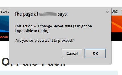
Request confirmation before potentially destructive actions
Why: Reduce the chance of errors and decrease users' mental burden. Users will feel more at ease if they know that anything that could get them fired or make them lose data will be duly signalled.
Example: a simple Javascript
alertmay suffice:
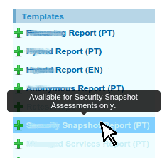
Explain why some actions aren't available
Why: Users have a hard time understanding how seemingly unrelated parts of the system affect each other. Explicitly saying that some specific functionality isn't available at some time (and saying why it isn't) goes a long way in making clear to users how different parts of the system interact.
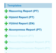
Example: Imagine you have a system that generates many kinds of reports based on assessments performed earlier on.
Since not every type of report can be generated for every kind of assessment, you could simply hide those that aren't available and let users wonder why sometimes they are there and sometimes they aren't.
Tooltips can be used to say why some actions aren't available and what users can to to enable them:


Note: This is only partially related to robustness, but such an important principle that it deserves mentioning here.


