Matplotlib examples: Number Formatting for Axis Labels
Last updated:Table of Contents
Full code available on this jupyter notebook
Comma as thousands separator
Formatting labels must only be formatted after the call to plt.plot()!
Example for y-axis: Get the current labels with .get_yticks() and set the new ones with .set_yticklabels() (similar methods exist for X-axis too):
import matplotlib.pyplot as plt
import numpy as np

# generate sample data for this example
xs = [1,2,3,4,5,6,7,8,9,10,11,12]
ys=np.random.normal(loc=10000,size=12, scale=20000) + 100000

# plot the data
plt.bar(xs,ys)

# after plotting the data, format the labels
current_values = plt.gca().get_yticks()
plt.gca().set_yticklabels(['{:,.0f}'.format(x) for x in current_values])
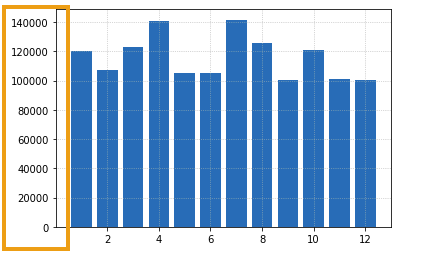 BEFORE: no formatting
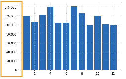 AFTER: thousands separated with commas
Disable scientific notation
As before, labels must only be formatted after the call to plt.plot()!
Example for y-axis: Get the current labels with .get_yticks() and set the new ones with .set_yticklabels() (similar methods exist for X-axis too)
import matplotlib.pyplot as plt
import numpy as np

# generate sample data for this example
xs = [1,2,3,4,5,6,7,8,9,10,11,12]
ys=np.random.normal(loc=0,size=12, scale=500000) + 1000000

# plot the data
plt.bar(xs,ys)

# after plotting the data, format the labels
current_values = plt.gca().get_yticks()
# using format string '{:.0f}' here but you can choose others
plt.gca().set_yticklabels(['{:.0f}'.format(x) for x in current_values])
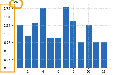 BEFORE: matplotlib will sometimes add
 scientific notation when numbers are large
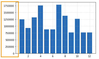 AFTER: no scientific notation
Format y-axis as Percentages
similar methods exist for X-axis too
Once again, get current labels with .get_yticks(), set new labels with .set_yticklabels():
import matplotlib.pyplot as plt
import numpy as np

# generate sample data for this example
xs = [1,2,3,4,5,6,7,8,9,10,11,12]
ys= np.minimum(np.random.normal(loc=0.5,size=12,scale=0.4), np.repeat(1.0, 12))

# plot the data
plt.bar(xs,ys)

# after plotting the data, format the labels
current_values = plt.gca().get_yticks()
# using format string '{:.0f}' here but you can choose others
plt.gca().set_yticklabels(['{:,.0%}'.format(x) for x in current_values])
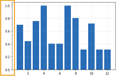 BEFORE: y-axis with float numbers
 that represent percentages or probabilities
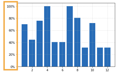 AFTER: numbers between 0 and 1 become percentages