Negative Design: Informing Users About What's Not There
Last updated:Now why would you want to do that?
See, design is mostly about using many elements to inform users and try to convey information with it. Normally, there's a tradeoff between content and form: since I deal mostly with web applications, I tend to tip that balance towards content, but try and do that in an elegant way so as not to render the overall ugly or too confusing, and so on.
One method I think could be a good way to convey more information in (web application/website) design is by informing the users what they can't do right now. It is a way to bring real-world constraints into your design and give more hints about what can be accomplished with that interface.
For example, suppose you have an application with a side bar that serves as a menu. In most (if not all) cases you'll need to run some code before rendering the menu so as to provide points of flexibility for different user types, different actions being available at a time.
For instance, you may have a use case where users can perform action A and action B, but they must do action A before action B, in other words they can't perform action B if they haven't performed action A first.
So you want to make a menu for an app that enables users to carry out action A and action B, and you will want to bring that constraint (no B before A) into your design. So you might have code like this:
if user has performed action A
     show menu item for action B only
else
    show menu item for action A only
end
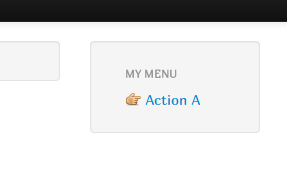
This would work, and would give you a menu like this when the user hasn't yet carried out action A:

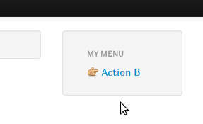
And one like this after a user has performed action A:

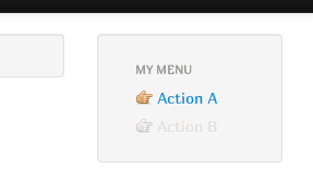
Now there's nothing wrong with that. Wouldn't probably deserve the best design of the year award but it does the job. I, however, think that you could put some more information on it. Now compare that with this:

You've effectively informed your user that both actions are available for him, but action B is momentarily unavailable. And, since the unavailable option is sort of grayed out, it doesn't make so much 'noise' on the screen. This is an effective technique to user for a variety of reasons:
introducing new functionality;
enforcing real-life constraints in your design (thereby reducing the need for a 'help' section(which nobody reads anyway));
conducting the user gently through a step by step process, in case you need one;
giving some background information about the system and what it can accomplish (if users just saw 'action A' like in the first example, they could think that your app doesn't support 'action B' at all, and could maybe leave it right then and there.)
P.S.: You could even add some tooltips to the controls, explaining further why they're not available at the time.