Pandas Examples: Plotting Date/Time data with Matplotlib/Pyplot
Last updated:- Plot date histogram per month
- Fill missing days in between
- Stacked barplot count per date, percentages
- Plot by start of week
You need to have the matplotlib module installed for this!
Versions used: Pandas 1.3.x, matplotlib 3.4.x
See many more examples on plotting data directly from dataframes here: Pandas Dataframe: Plot Examples with Matplotlib and Pyplot
Examples on how to plot date/time data from within pandas dataframes, using various methods.
All code can be found on this jupyter notebook online
Plot date histogram per month
import pandas as pd

# source dataframe
df = pd.DataFrame({
    'name':[
        'alice', 'bob', 'charlie', 'david', 'edward', 'felicia'
    ],
    'date_of_admission':[
        '2021-10-28', '2022-01-24', '2022-03-25', '2022-04-11', '2022-03-01', '2022-03-30'
    ],
})
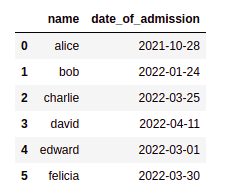 Original dataframe, using strings for dates (in American format)
Now convert the date column into datetime type, use groupby() and plot():
# convert column to datetime
df['date_of_admission'] = pd.to_datetime(df['date_of_admission'])

# create a representation of the month with strfmt
df['year_month_of_admission'] = df['date_of_admission'].map(lambda dt: dt.strftime('%Y-%m'))

grouped_df = df.groupby('year_month_of_admission').size().to_frame("count").reset_index()

grouped_df.plot(kind='bar', x='year_month_of_admission', y='count')
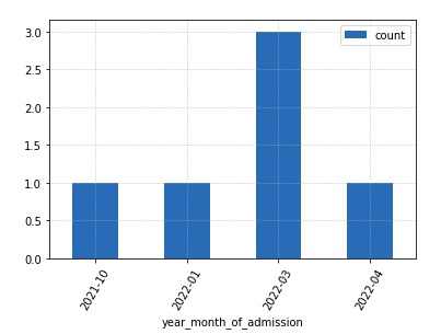 Number of new employees admitted per month
Fill missing days in between
For Offset Alias strings other than
'D', see this: Offset Aliases
We can add "fake" rows by using a DateTimeIndex and the asfreq methods.
This is useful when you have to plot aggregate data (counts, sums, etc per date) and you want to make sure that missing data is conspicuous, so that everyone can see if/when there's missing data.
import pandas as pd

# source data before aggregation
df = pd.DataFrame({
    'item_id':[
        '273','231', '133', '555', '123','234','342'
    ],
    'purchase_date':[
        '1988-12-28', '1988-12-24', '1988-12-25', '1988-12-25', '1988-12-26', '1988-12-28' , '1988-12-30',
    ],
})

# group by to find out how many purchases we had per day
grouped_df = df.groupby('purchase_date').size().to_frame("count").reset_index()

# here we set a new index using the datetime column
datetime_series = pd.to_datetime(grouped_df['purchase_date'])
datetime_index  = pd.DatetimeIndex(datetime_series.values)
grouped_df.set_index(datetime_index, inplace=True)

# IMPORTANT! we can only add rows for missing periods
# if the dataframe is SORTED by the index
grouped_df.sort_index(inplace=True)

# we change the FREQUENCY of the dataframe using asfreq
grouped_df_filled_missing = grouped_df.asfreq('D')

# just plot as you normally would
grouped_df_filled_missing.plot(kind='bar', y='count')
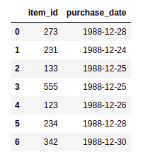 RAW DATA: Items and purchase dates
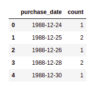 AGGREGATED DATA (number of purchases, grouped by date)
 Note that there is no data for 27th and 29th
Now for the plot results:
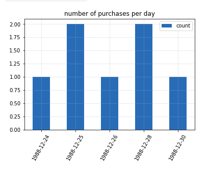 Simply plotting the aggregated data
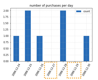 Using a
 DateTimeIndex we were able to fill the holes so to speak.
This makes it much clearer to viewers that
there were days with NO purchases
Stacked barplot count per date, percentages
Plot the number of visits a website had, per day and using another column (in this case browser) as drill down.
Just use df.groupby(), passing the DatetimeIndex and an optional drill down column.
from datetime import date,datetime,timedelta

import matplotlib.pyplot as plt
import matplotlib.ticker as mtick
import numpy as np
import pandas as pd

np.random.seed(42)

# create a dummy dataset
df = pd.DataFrame(
    index=pd.to_datetime(
        [datetime(2019,1,1)+timedelta(hours=h+10*np.random.uniform()) for h in range(0,1000)]
    ),
    data={
        'browser': np.random.choice([
            'chrome',
            'firefox',
            'safari',
            'edge'
        ],size=1000,replace=True)
    },

)

print(type(df.index))
# 'pandas.core.indexes.datetimes.DatetimeIndex'

# just to make it more intuitive
df.index.name= 'login_datetime'

# you can pass a lambda function to the groupby function
# so that it groups by the day (or anything else you want)
df.groupby(by=[lambda dt: dt.strftime('%Y-%m-%d'),'browser']).size().groupby(level=0).apply(
    lambda x: 100 * x / x.sum()
).unstack().plot(kind='bar',stacked=True,legend='reverse',width=0.8)

plt.gca().yaxis.set_major_formatter(mtick.PercentFormatter())
plt.show()
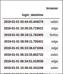 Sample dataframe: each line
 represents an individual visit to
a given website, and the browser
used.
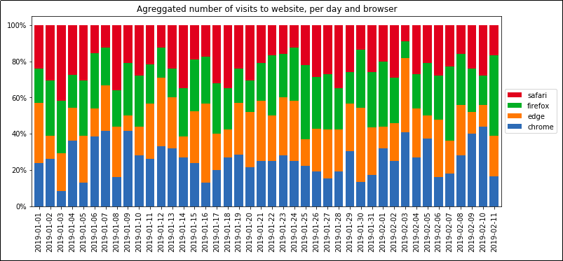 Agreggated number of visits to
 website, per day and browser
Plot by start of week
TODO get start of the week, group by