Matplotlib: Pyplot By Example
Last updated:
- Change Figure size
- Save plot to file
- Multiple subplots in Figure
- Set Figure Title, Font size
- Set Axes Title, Font size
- Tick label rotation
- Set y-axis, x-axis labels and Font size
- Set y-axis, x-axis limits
- Label points in plot
- Set tick frequency
- Add Axis grid
- Histogram, numpy array
- Twin plots
- Align axis labels on twin axes
- Custom color cycle
Pyplot or Matplotlib? What's The difference?
Updated for Matplotlib 3.x
Change Figure size
After plotting, get a reference to the current figure and call set_size_inches(width,height):
import numpy as np
import matplotlib.pyplot as plt

x = np.linspace(0.0,100,50)
y = np.random.uniform(low=0,high=10,size=50)

plt.scatter(x,y)

# get reference to the current figure
fig = plt.gcf()
fig.set_size_inches(8,3)

plt.show()
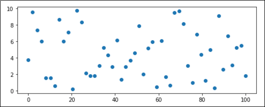 Customized image with 8x3 inches.
 (Default size is 6x4)
Save plot to file
Use plt.savefig().
The image format is deduced from the extension ('png', 'jpg', 'svg', etc)
import numpy as np
import matplotlib.pyplot as plt

x = np.linspace(0.0,100,50)
y = np.random.uniform(low=0,high=10,size=50)

plt.scatter(x,y)

plt.savefig('out.png')
Multiple subplots in Figure
View Matplotlib Subplots: Best Practices and Examples more multiple subplot examples
Call plt.subplots() to get a figure reference and individual Axes references (one for each subplot)
import numpy as np
import matplotlib.pyplot as plt

x = np.linspace(0.0,100,50)
y = np.random.uniform(low=0,high=10,size=50)

# passing 2,2 as parameters indicates that you will
# get 4 subplots (2 rows and 2 columns)
fig, axes = plt.subplots(2,2)

# just plot things on each individual axes

axes[0][0].scatter(x,y,c='red',marker='+')

axes[0][1].bar(x,y)

axes[1][0].scatter(x,y,marker='x')

axes[1][1].barh(x,y)
# you can set the title for a single subplot
axes[1][1].set_title('Plot 4',size=14)

plt.show()
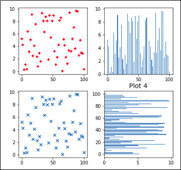 Create a figure with 4 individual subplots using
 plt.subplots(). (Note that only Plot 4 has had its Title set.)
Set Figure Title, Font size
import numpy as np
import matplotlib.pyplot as plt

x = np.linspace(0.0,100,50)
y = np.random.uniform(low=0,high=10,size=50)

plt.scatter(x,y)

# get reference to the current figure
fig = plt.gcf()

# HERE
fig.suptitle('IMAGE TITLE HERE', fontsize=18)
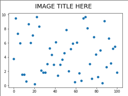
suptitle() acceps parameters you would normally use in matplotlib.Text
Set Axes Title, Font size
Similar to the above, but acts on a single Axes (useful if you have multiple suplots on the same Figure).
Use ax.set_title(<text>)
import numpy as np
import matplotlib.pyplot as plt

x = np.linspace(0.0,100,50)
y = np.random.uniform(low=0,high=10,size=50)

plt.scatter(x,y)

# get reference to the current axis
ax = plt.gca()

# HERE
ax.set_title('title for this axes only', fontsize=20)
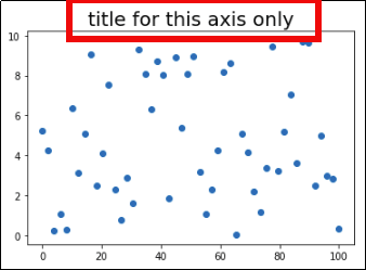 If there were multiple axis in a
 single Figure, only that Axis would have
its Title set
Tick label rotation
Use plt.xticks(rotation=<degrees>) or plt.yticks(rotation=<degrees>)
To call this on an
Axesobject instead, do:ax.tick_params(axis='x',rotation=60)or equivalently for the 'y' axis
import numpy as np
import matplotlib.pyplot as plt

x = np.linspace(0.0,100,50)
y = np.random.uniform(low=0,high=10,size=50)

plt.plot(x,y)

# rotating labels on the xaxis
plt.xticks(rotation=60)
# y axis
plt.yticks(rotation=60)
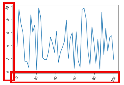 Change the label rotation in 60 degs for both the x-axis
 and the y-axis with
plt.xticks(60) and plt.yticks(60)
Set y-axis, x-axis labels and Font size
Use plt.xlabel() or plt.ylabel(), using the same arguments that are accepted by plt.text().
import numpy as np
import matplotlib.pyplot as plt

x = np.linspace(0.0,100,50)
y = np.random.uniform(low=0,high=10,size=50)

plt.plot(x,y)

# HERE
plt.xlabel('time (s)',color='red',fontsize=30)
plt.ylabel('temperature (C)', fontsize=15)
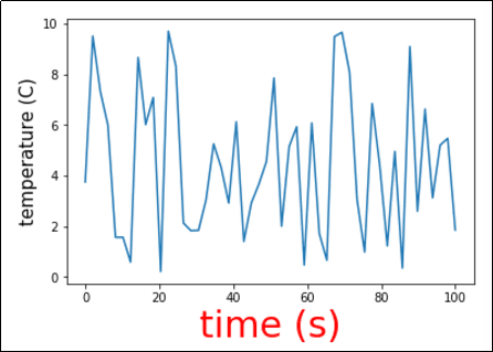 You can use any other arguments from plt.text() too.
Set y-axis, x-axis limits
import numpy as np
import matplotlib.pyplot as plt

x = np.linspace(0.0,100,50)
y = np.random.uniform(low=0,high=10,size=50)

# for the whole plot
plt.plot(x,y)

# HERE
plt.ylim(-5,15)
plt.xlim(-30,130)
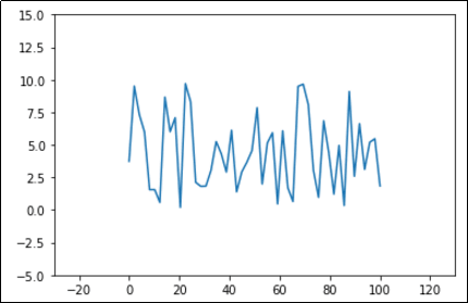 Same data as before, with more room around it.
Label points in plot
This was inspired by a guy on stackoverflow but I can't remember. If you know please send a message.
First define a function called plot_value_labels() and call it on your axis:
def plot_value_labels(axis):
    rects = axis.patches

    # For each bar: Place a label
    for rect in rects:
        # Get X and Y placement of label from rect.
        y_value = rect.get_height()
        x_value = rect.get_x() + rect.get_width() / 2

        label = '{:.2f}'.format(y_value)

        # Vertical alignment for positive values
        va = 'bottom'

        # If value of bar is negative: Place label below bar
        if y_value < 0:
            # Invert space to place label below
            space *= -1
            # Vertically align label at top
            va = 'top'

        # Create annotation here
        axis.annotate(label, (x_value, y_value),
                      xytext=(0, 2),
                      textcoords="offset points",
                      ha='center',
                      rotation=45,
                      va=va)

# now the actual code
import matplotlib.pyplot as plt
import numpy as np

# generate sample data for this example
x = np.linspace(0.0,10,10)
y = np.random.uniform(low=0,high=6,size=10)

# plot bar plot
plt.bar(x,y)

# call the function we defined
plot_value_labels(plt.gca())
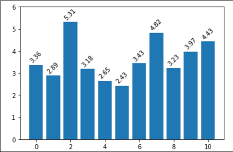 Simple labels on top of bars in a bar plot
Set tick frequency
Use plt.xticks with np.arange (for the y-axis, use yticks instead).
Template: plt.xticks(np.arange(<start>,<end>,<step>)).
import numpy as np
import matplotlib.pyplot as plt

# generate sample data for this example
x = np.linspace(0.0,100,50)
y = np.random.uniform(low=0,high=10,size=50)

plt.plot(x,y)

# HERE tell pyplot to write a x-axis tick every 5 units
plt.xticks(np.arange(0, 100, 5))
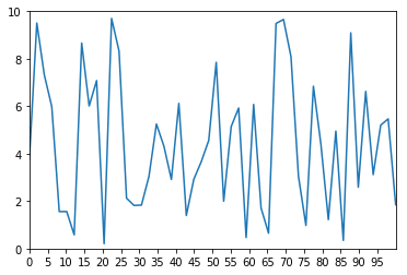 X-Axis ticks are drawn every 5 units, as per the call to
 xticks
Add Axis grid
All options available to Line2D can be passed to the
grid()function.
Use ax.grid(True) on the axis object
To add grid for the whole figure instead, simple use
plt.grid(True)
import matplotlib.pyplot as plt
import numpy as np

# generate sample data for this example
x = np.linspace(0.0,100,50)
y = np.random.uniform(low=0,high=10,size=50)

# HERE linewidth and linestyle are some of the options you can set
# gca means Get Current Axis
plt.gca().grid(True, linewidth=0.7, linestyle=':')

# then plot the chart as you would normally
plt.plot(x,y)
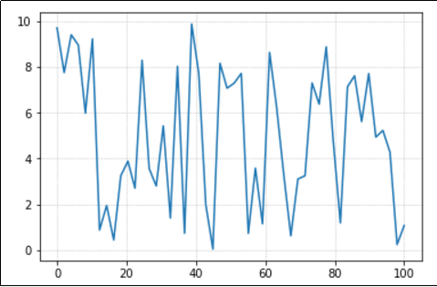 0.7 is a reasonable setting for the line width
Histogram, numpy array
View all API options: pyplot docs: pyplot.hist
import matplotlib.pyplot as plt
import numpy as np

# generate sample data following a normal distribution
values = np.random.normal(size=100)
# array([ 0.49671415, -0.1382643 ,  0.64768854,...

# see all examples in the API link
plt.hist(values,rwidth=0.9,bins=[-3,-2,-1,0,1,2,3])
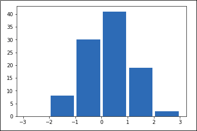 A histogram is a simple chart that shows how frequent
 each value is. It shows the discrete distribution of values in
a collection.
Twin plots
To create a figure with a second y-axis in the same plot, use ax.twinx():
import matplotlib.pyplot as plt
import numpy as np

plt.clf()

# generate sample data for this example
xs = [1,2,3,4,5,6,7,8,9,10,11,12]
ys_bars = np.random.normal(loc=3.0,size=12)
ys_lines = np.random.normal(loc=5.0,size=12,scale=0.5)

# this is the axis on the left
ax1=plt.gca()
ax1.bar(xs,ys_bars,color='green')

# order is important when setting ticks.
# Ticks must be set after the plot has been drawn
ax1.set_yticks(np.arange(0,11,1))
ax1.set_yticklabels(np.arange(0,11,1),color='green')

# create the 'twin' axis on the right
ax2=ax1.twinx()

# plot the same numbers but multiplied by 20
ax2.plot(xs,ys_lines*20,color='red')

# set the ticks and ticklabels for the twin axis
ax2.set_yticks(np.arange(0,101,10))
ax2.set_yticklabels(np.arange(0,101,10),color='red')

# set ticks for the common x axis (bottom)
ax2.xaxis.set_ticks(xs)
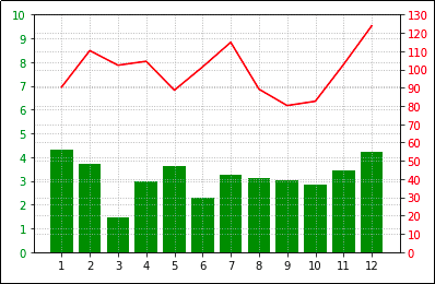
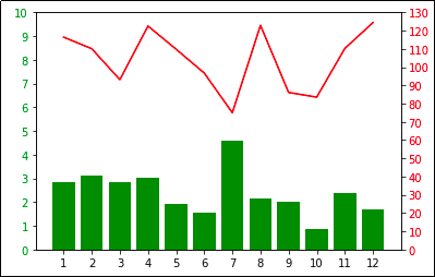 Plot two different series on the same graph.
 Note that each axis has a different scale.
Align axis labels on twin axes
Use ax.yaxis.set_major_locator(LinearLocator(numticks)) on both the original and the twin axis, with the same number of ticks.
import matplotlib.pyplot as plt
import numpy as np

plt.clf()

# generate sample data for this example
xs = [1,2,3,4,5,6,7,8,9,10,11,12]
ys_bars = np.random.normal(loc=3.0,size=12)
ys_lines = np.random.normal(loc=5.0,size=12,scale=0.5)

# this is the axis on the left
ax1=plt.gca()

ax1.bar(xs,ys_bars,color='green')

# order is important when setting ticks.
# Ticks must be set after the plot has been drawn
ax1.set_yticks(np.arange(0,11,1))

# define the number of ticks
NUM_TICKS=11

# change the tick locator for this axis and set the desired number of ticks
ax1.yaxis.set_major_locator(plt.LinearLocator(numticks=NUM_TICKS))

# create the 'twin' axis on the right
ax2=ax1.twinx()

# plot the same numbers but multiplied by 20
ax2.plot(xs,ys_lines*20,color='red')

# set the ticks for the twin axis
ax2.set_yticks(np.arange(0,101,10))

# change the tick locator for this axis and set the desired number of ticks
ax2.yaxis.set_major_locator(plt.LinearLocator(numticks=NUM_TICKS))

# set ticks for the common x axis (bottom)
ax2.xaxis.set_ticks(xs)
 Since each axis has a different
 scale, adding grids may
make things look ugly.
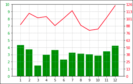 You can align the scales using
 plt.LinearLocator() to set the number of ticks you want in both scales.
Custom color cycle
If you wish to override the default colours used by pyplot (for example, to make it easier to colourblind people to view your images), you can use set_prop_cycle() on an Axes instance:
import numpy as np
import matplotlib.pyplot as plt

# generate random data for plotting
x = np.linspace(0.0,100,50)
y2 = x*2
y3 = x*3
y4 = x*4
y5 = x*5
y6 = x*6

# plot multiple lines in the same plot
plt.plot(x,y2,label='y=2x')
plt.plot(x,y3,label='y=3x')
plt.plot(x,y4,label='y=4x')
plt.plot(x,y5,label='y=5x')
plt.plot(x,y6,label='y=6x')

colour_blind_cycle = ['#377eb8', '#ff7f00', '#4daf4a',
                  '#f781bf', '#a65628', '#984ea3',
                  '#999999', '#e41a1c', '#dede00']

plt.gca().set_prop_cycle(color=colour_blind_cycle)

plt.legend()
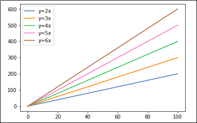 A simple line plot using a colourblind-friendly color scheme
 (Props to user thriveth on Github.)